Why you should start using Pantone System now!
Starting out as a designer, I struggled while trying to match my designed artworks with prints by different companies. Until one day my colleague introduced me to the world of Pantone and its Formula Guide.
It made me wish I knew about their system earlier! In this article, you will understand why.
What is Pantone?
Pantone Color Institute is globally famous for its color expertise. It provides color insights, and collaborates with brands and designers in building color strategies to suit their needs. It introduced a unique tool to help clients choose colors and use them around the world.
Many companies from different industries, such as graphic design, fashion, clothes, fabrics, interior design and architecture depend on Pantone systems in selecting colors for their projects.
Pantone provides different services such as color trend forecasting and brand color development. It inspires designers and teaches them the basics of color selection as color is one of the most important factors in building brands and creating their corresponding moods. Pantone believes that choosing the right color will increase sales effectively by up to 50 – 80%.
Pantone Collaboration
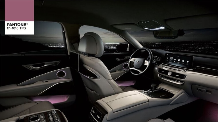
Pantone collaborates with a number of brands from different industries. One example is their collaboration with Kia motors. They selected the interior lighting shades for their K900 cars.
On that collaboration, Luri Brisman said: “We knew kia wanted the k900 to be something more than a mere mode of physical transport, more like a space for rest or tranquility, relax and recharge even for inspiration” (Source: Pantone.com)
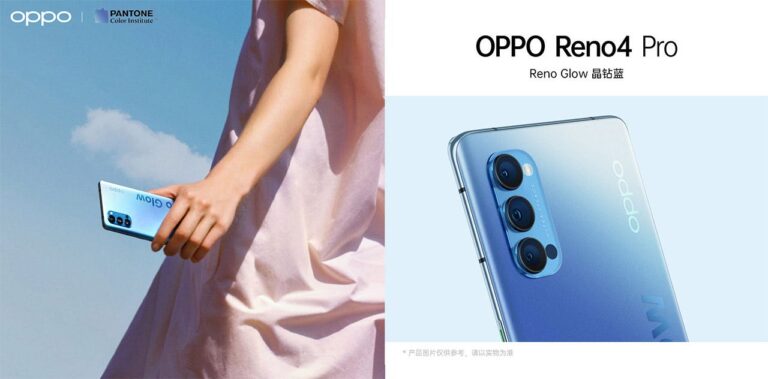
In the technology industry, Pantone Color institute worked with OPPA to select the new colors for their Reno Series of mobile phones. They wanted to implement a color and design concept that would engage a forward thinking, and technologically savvy audience.
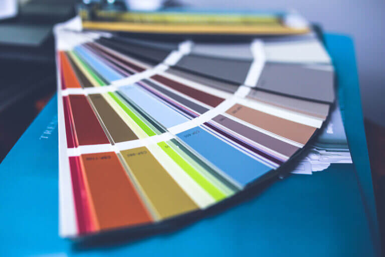
Pantone Matching System
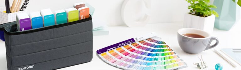
This unique system is used by millions of designers and producers. It consists of numbering shades of colors that are used for graphic design, packaging, print and digital works.
It is fair to say that it is a universal language which designers and artists understand all over the world.
You will never have to worry about matching colors when sharing your artworks with other companies again.
For more information: https://www.pantone.com/color-systems/for-graphic-design
THE PANTONE FASHION, HOME + INTERIORS (FHI) SYSTEM
This tool is used for fashion, textiles, fabric, interior designs, pigments, leather, cosmetics and accessories.

All FHI Swatch Cards are supported by digital spectral data, so you can be confident your final product will match your vision. Swatch cards are available for all Cotton, Nylon, and Polyester colors. Each material has unique properties, and therefore a uniquely achievable range of colors. (Source: Pantone.com)
Where Can I find Pantone Color Tools?
You can buy their products through the following links:
Color of the year
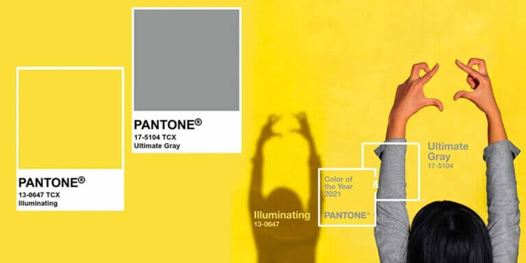
Every year Pantone chooses a color to represent the year and influences products across fashion, home furnishings, and industrial design. For example, the color of 2018 was Ultra Violet, and for 2019 it was living coral, which is a shade of orange, and for 2020, classic blue which represents calmness and creativity.
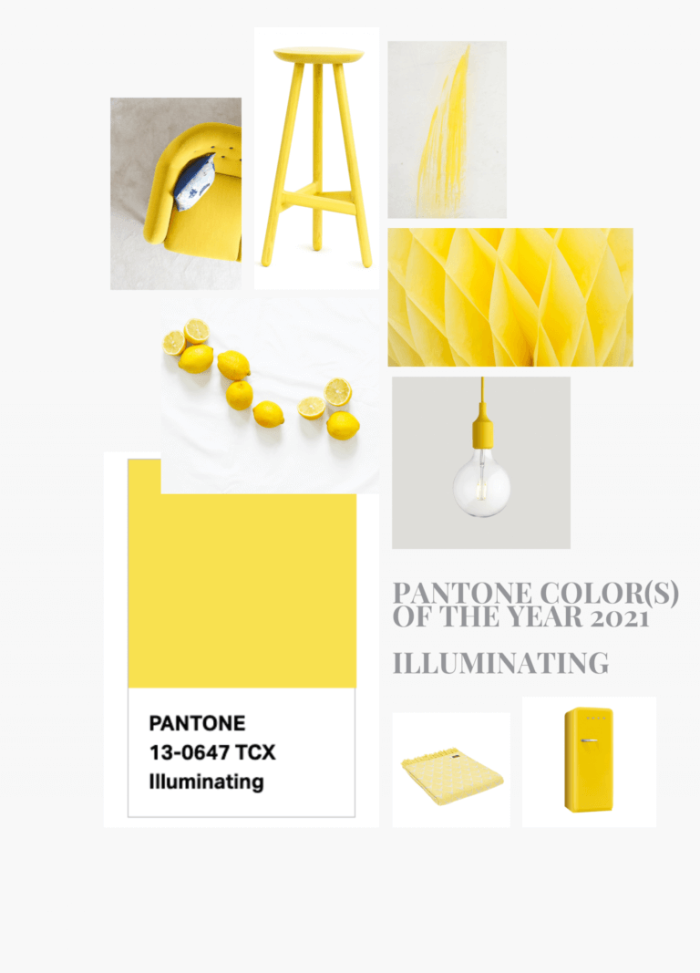
In this year, and due to the Covid-19 situation, Pantone decided to select two colors: PANTONE 17-5104 Ultimate Gray + PANTONE 13-0647 Illuminating. The company explains that choosing two different colors as indecent but complementary. The grey represents the pandemic and the yellow represents the vitality and harmony.
People are looking for hope and optimism, and they need to support each other and spread hope which is vital for us humans.
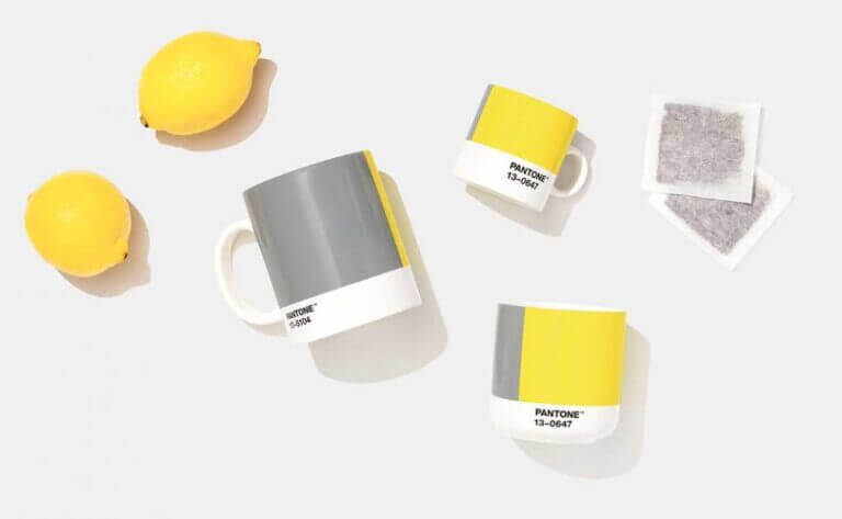
Have a look at some examples of Color of the Year applications:
In Conclusion
Pantone Color Institute is a global company specialized in making colors, and it contributes effectively supporting different industries such as graphic design, interior designs, fashion and technology.
They offer two important tools :
- Pantone Matching System: for graphic design and packaging.
- The Pantone Fashion, Home + Interiors (FHI) System: for interiors, textile and fashion.
Do you use Pantone systems in your work? Feel free to drop us a message for any inquiry!